OTW
OTW by Vans was preparing to launch a new digital experience positioned as a more elevated, minimalist extension of the Vans brand. The team needed to validate whether the new mobile-first experience clearly communicated brand intent while maintaining usability across the shopping journey.
Through two rounds of mixed-method usability testing (44 total participants across segments), I evaluated the homepage, menu, PLP, PDP, and sort/filter experience to identify friction points and de-risk launch decisions.
The Problem
The OTW experience was intentionally minimal.
The risk?
Minimalism could either feel premium — or confusing.
Key questions:
Does the homepage clearly communicate what OTW is?
Can users easily navigate from homepage to product?
Does the PLP and PDP support confident purchasing?
Is the sort/filter experience intuitive for the OTW audience?
Are we creating friction that could suppress conversion?
This was especially important because OTW was positioned differently than Vans’ core site. Brand clarity and usability were equally critical.
Key Findings
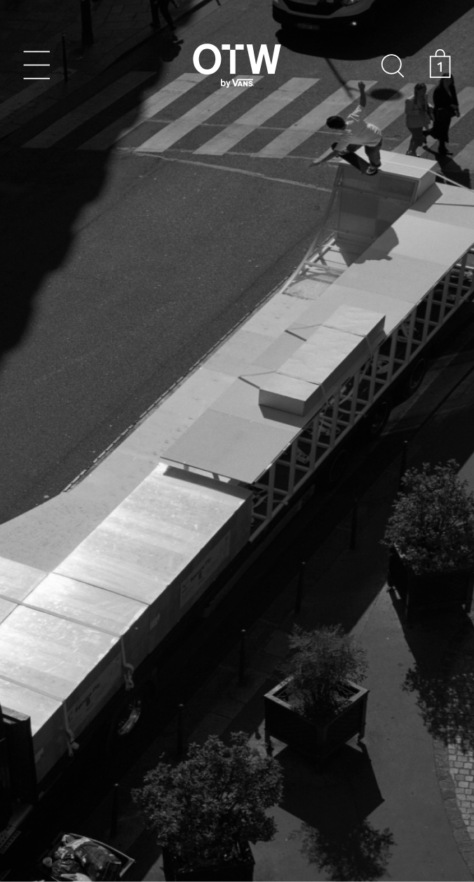
Homepage: Curiosity Without Clarity
The homepage was visually compelling but lacked clear orientation.
From Round 1:
73% of participants were confused by the homepage display and lack of content OTW 1-part-3
100% were unsure what the homepage indicated or what the site was about OTW 1-part-3
“By Vans” was recognized, but often described as too small OTW 1-part-3
Participants described the experience as:
“Sleek” and “mysterious”
But also “confusing” and “hidden”
Insight:
Minimalism created intrigue — but not enough orientation to support first-time visitors.
Risk:
Brand ambiguity at entry point could suppress trust and product exploration.
My Role
I led research strategy and execution across two iterative testing phases, ensuring the OTW experience balanced brand ambition with usability clarity ahead of launch.
Defined core product risks (brand ambiguity, discovery friction, terminology confusion) and scoped a phased research plan to de-risk launch.
Partnered with Product and Design to align on decision criteria and translate findings into prioritized, launch-ready actions.
Led two rounds of mobile usability testing (44 participants across segments), synthesizing behavioral and attitudinal patterns into clear product direction.
Distinguished critical fixes from enhancements, enabling the team to ship confidently while building a roadmap for iteration.
Rather than delivering isolated insights, I framed research in terms of business impact, reducing ambiguity, protecting brand clarity, and strengthening product discoverability.
Strategic Recommendations
I divided recommendations into Pre-Launch (critical clarity fixes) and Post-Launch (experience enhancements) to align with launch timelines.
Pre-Launch
Introduce OTW clearly on homepage
Scale up “By Vans” for brand recognition
Add onboarding statement
Adjust menu verbiage (“About OTW”)
Replace “shoe silhouette” with clearer terminology
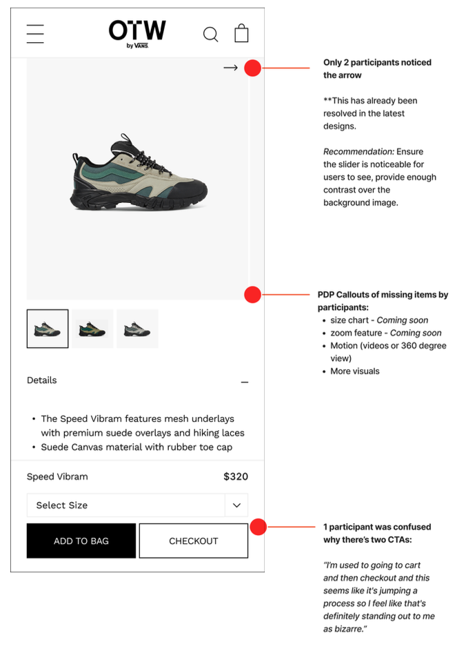
Add color swatches to PLP product cards OTW 1-part-3 OTW WIP
These changes reduced brand ambiguity and improved product discoverability.
Post-Launch Enhancements
Add video + 360 rotation on PDP
Consider virtual try-on
Add filter facets for color and shoe style
Improve accessibility contrast & tap targets OTW 1-part-3 OTW WIP
These supported long-term engagement and premium positioning.
Impact
This research directly influenced pre- and post-launch decisions across the OTW mobile experience.
Reduced Brand Ambiguity at Entry Point
Identified that 73% of participants were confused by the homepage and 100% were unsure what the site was about in Round 1 OTW 1-part-3
Led to scaling “By Vans,” clarifying brand positioning, and introducing onboarding language prior to launch
Impact: Mitigated risk of early-session drop-off due to brand confusion and strengthened first-impression trust.
This work:
Prevented launch with brand ambiguity at the homepage
Reduced terminology friction in sort/filter
Improved product scanning via color swatches
Strengthened alignment between design intent and user expectation
Created a prioritized roadmap separating critical fixes from enhancements
Additionally, Round 2 testing validated that the PLP and filter structure were fundamentally sound, reducing risk of unnecessary redesign.