Smartwool Merino
The Problem
Smartwool customers were frequently confused about what sock cushioning means — particularly its relationship to comfort, performance, fit, and warmth. This misunderstanding translated into hesitation in product exploration and filters, and an inconsistent path to conversion.
At the same time, internal content strategy lacked clarity and visual storytelling conventions that would help users form accurate mental models about cushioning types.
Key Questions:
How can we clarify What cushioning is — and what it isn’t — to reduce friction in the shopping journey?
What content formats and visual elements best help users build correct expectations about product performance?
How can the educational experience guide users back into relevant product discovery paths?
Approach
Mixed Methods Lens
Competitive Analysis:
I benchmarked how leading outdoor apparel brands communicate cushioning, highlighting effective visual storytelling via GIFs, close-up imagery, and clear categorization of material layers.Heuristic and Best Practice Audit:
Applied e-commerce usability principles (e.g., cognitive load minimization, clear visual hierarchy) from sources like Baymard Institute to assess structural gaps and opportunities in the existing content framework.Qualitative Testing:
Conducted moderated usability sessions with a dedicated UX researcher, synthesizing user responses to different content arrangements and visualizations. Observational feedback (expressions, hesitation, comments) informed where clarity broke down.Prototype Evaluation:
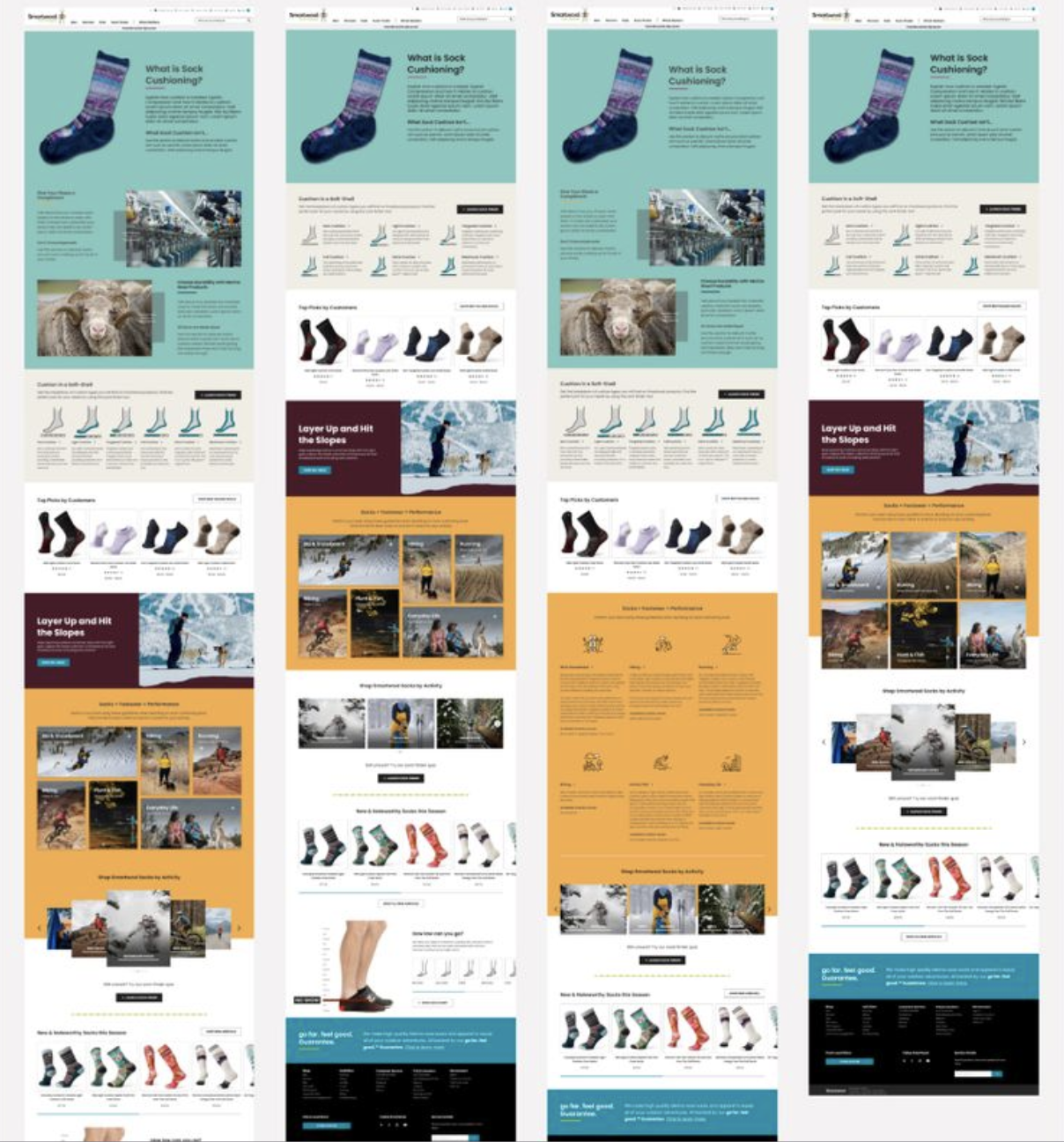
Iterative high-fidelity prototypes were built and evaluated in Figma, focusing on interactive educational modules that explained cushioning categories and linked to tailored product lists.
My Role
As UX Research Lead, I owned the research strategy focused on clarifying customer mental models around both sock cushioning and merino wool performance benefits. Early signals showed that customers were conflating cushioning with warmth and lacked a clear understanding of how merino wool contributes to comfort, moisture management, and durability — creating friction in product selection.
I defined the core educational gaps and scoped a mixed-method approach to evaluate how content structure, visual hierarchy, and storytelling could better support comprehension. Through competitive benchmarking, heuristic and content audits, and moderated usability testing, I identified where terminology and visuals were increasing cognitive load and where stronger educational scaffolding was needed.
Strategic Recommendations
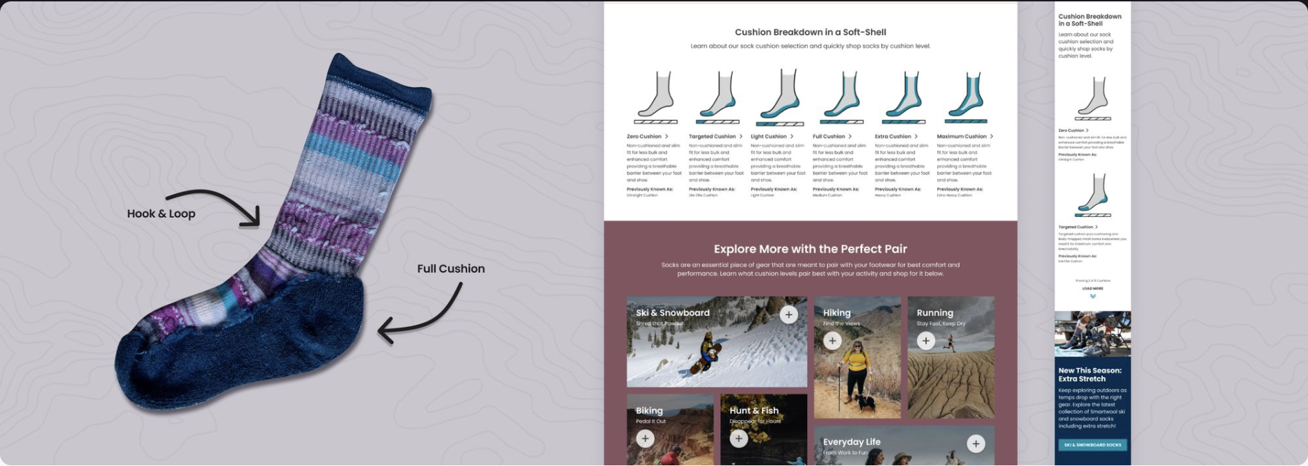
Enhance Visual Storytelling: Incorporate detailed visuals explaining cushioning types and material differences on the landing page.
Content Structure First: Streamline content flow to focus strictly on cushioning concepts while offering direct paths into product discovery via clear CTAs and pre-filtered PLP links.
Extend Educational Elements: Recommend ongoing iteration by embedding cushioning guidance on PDPs and potential future education modules (e.g., sock height guides).
Impact
Increased stakeholder buy-in: Qualitative evidence from testing aligned closely with observed analytics patterns (from Content Square), strengthening trust between UX and brand leadership.
Actionable visual content roadmap: Brand partners committed to reshooting inside-out sock photography — a direct result of testing insights — to reinforce product clarity.
Improved strategic alignment: While not fully developed on the live site, the project influenced subsequent UX content strategy decisions and laid the foundation for integrating more rich educational elements directly into product pages.
Demystifying Sock Cushioning Through UX Insights & Visual Storytelling